Color Me Happy
- southernrootslivin
- Jul 12, 2021
- 2 min read
Updated: Jan 9, 2022
It is my belief that there aren’t any hard “rules” when it comes to color in a home. Some people like the colorful eclectic schemes while others prefer more neutral, calming tones with maybe just a splash of bold color here and there. Neither of these people are “wrong” in their preferences. Color is one of the true mediums we can use to express our personal design styles and make a house feel like home. Marcy and I are prime examples of this, we have different personal styles but we appreciate how well we have chosen to accomplish our respective styles with complimentary color palettes. However, if you are not sure where to start and are overwhelmed looking at a color wheel, here are 5 simple tips to get you started and achieve a cohesive look with your color choices, whatever they may be!
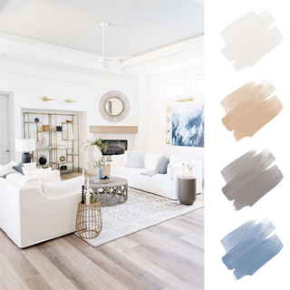
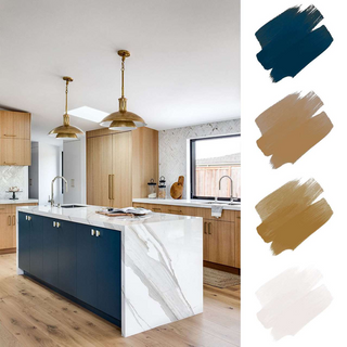
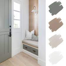
1) Limit the color palette to 4-6 colors but try to make at least half of those choices more neutral tones like white, blacks, greys, and taupes that will help you highlight the more vibrant color choices. Balance is always pleasing to the eye. Here are some examples of some color palettes provided by @mydomaine
2) Use the 60-30-10 guideline: 60% should be the dominant color which most often is your walls. The secondary color tones make up 30% which is mostly furniture and some larger textiles and the 10% are accent colors which can accomplished with smaller textiles like throws, pillows, lamp shades, and decorative pieces.

3) Most rooms (aside from maybe a study or lounge) do well when you break up the color with contrast. Use the colors so that it goes vertically from dark to light or vice versa. Remember that the ceiling is another wall for you to be creative with! If you want to use a darker trim with lighter walls, this is okay too! Just try to be consistent throughout the house with this, or at least limit to spaces where there is a clean break in transition.


4) To ensure a cohesive look throughout the house, choose one or more of the colors to carry into an adjoining room. You can branch out and be different but keeping with at least one of your chosen colors and other complimentary shades will make for better flow from room to room.

5) Don’t be afraid to use bold colors and patterns in small spaces or on feature accent walls. Often people misconceive that if it is a small space, lighter is better because it will make it feel bigger. However, using a eye-catching color will make it feel more inviting and cozy. Small rooms like powder bathrooms are a great place to allow your inner-designer take a bit more risk with color. I find that it's the choices you are hesitant to take are often the most rewarding and admired in the end! How cool is this bathroom?!


Comments